Is this Windows 11’s new modern cursor? Microsoft quietly shows a redesigned pointer mock-up
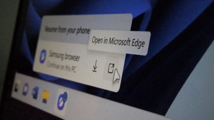 Microsoft seems to be working on a redesigned pointer for Windows 11
 The Experimental Windows 11 build released September 8, Build 26340.9354, includes an official Microsoft mock-up showing the new Resume hovercard, but it surprisingly shows a new mouse pointer. It’s slightly broader, softer around the lower-left side, and more symmetrical, without the thin tail-like extension we saw for decades in Windows.
Microsoft hasn’t said it changed the system cursor. The release notes for this build do mention fixing a known issue where cursor customization doesn’t work correctly, which we first reported. But nothing about a redesign.
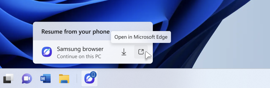 A new cursor mockup shown in Windows 11 Insider build changelog. Source: Microsoft
But there’s history here. Back in June, there were reports that Microsoft was internally testing a new Windows 11 mouse pointer as part of the Windows 11 modernization effort. However, Microsoft hadn’t shown the design publicly back then.
Three months later, we may finally have our first public glimpse of what Microsoft was testing. The new cursor will be based on this mock-up. The size and shadow you see here may be different as well when it finally arrives.
The cursor in Microsoft’s screenshot looks a lot like a Fluent icon
Microsoft’s Fluent UI System Icons repository contains a Cursor icon with a noticeably cleaner, wider shape than the traditional Windows arrow. The 32px light PDF version is particularly close in proportion to the shape in Microsoft’s new screenshot, an outlined pointer with a straighter left edge and a more geometric body.
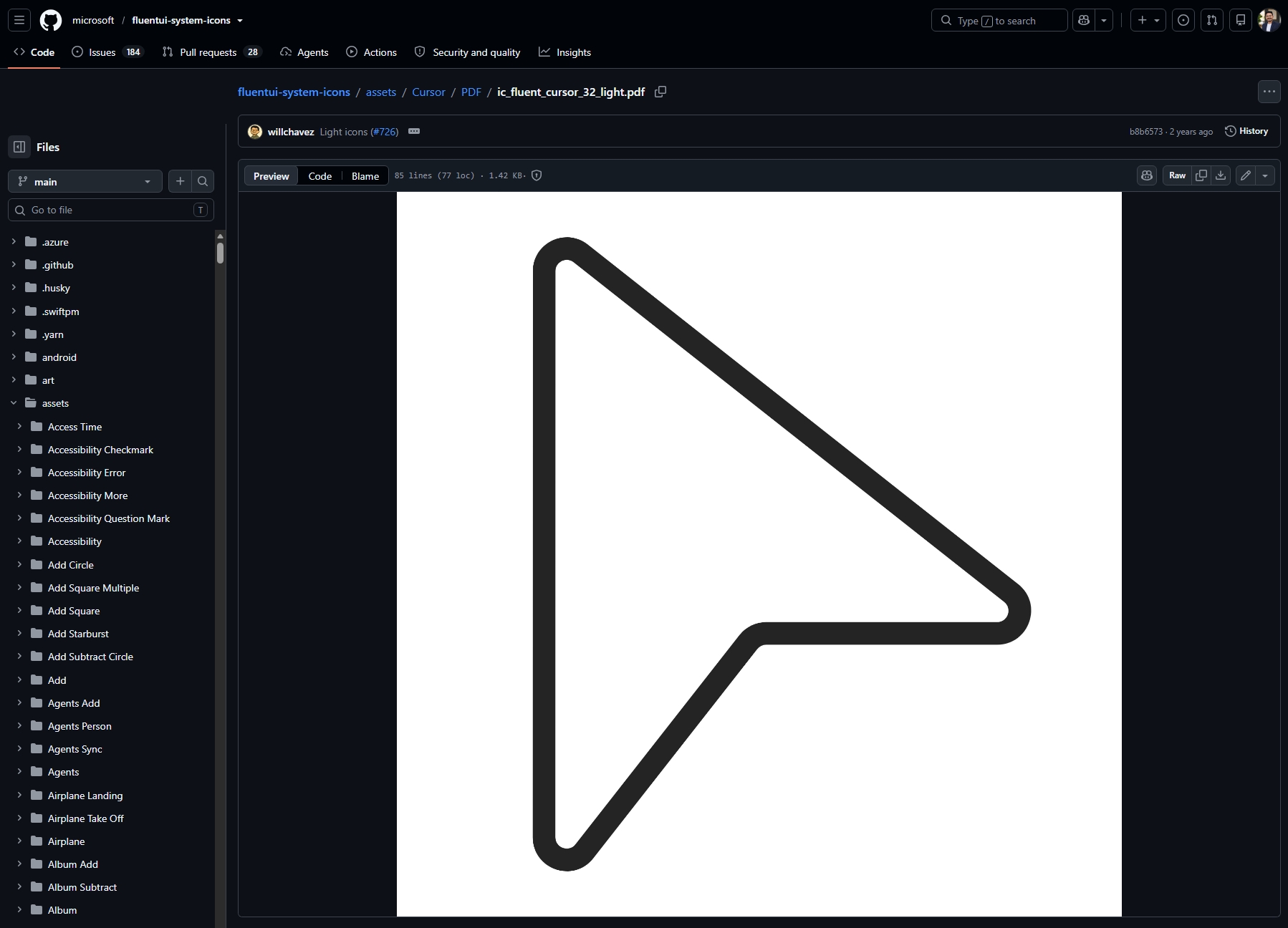
Of course, this resemblance isn’t enough to prove Windows has adopted it. It’s just a design-system icon. Microsoft’s current developer documentation still describes the standard pointer as the “arrow cursor,” and the Windows App SDK lists Arrow as the standard northwest-pointing shape. Microsoft already has a modern cursor-shaped Fluent asset.
The design language itself isn’t new. Fluent System Icons has existed since 2020, and the repository’s commit history stretches back so far. To be honest, it’s high time that Microsoft applies this language to the one element users see all day.
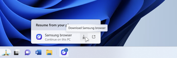 A new cursor mock-up featured in Windows 11 Insider build doesn’t have a tail
Windows 11 has modernized almost everything around the pointer, but the pointer stayed behind
Windows 11 has replaced old Settings pages, dialogs, and File Explorer pieces with modern WinUI over the past year, including a modernized mouse indicator that highlights your cursor when you press Ctrl. The pointer’s shape, meanwhile, has stayed the same arrow for years, with customization limited to size, color, and pointer schemes.
I’ve seen Microsoft use much more stylized cursors in presentations and promotional material over the years and always wondered why the real pointer still looked so plain.
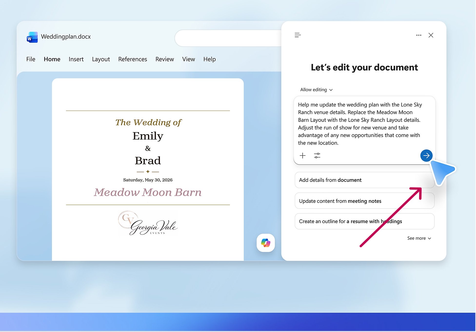 Stylized cursor in Windows 11 promos
macOS and several Linux desktop environments already have modern softer pointers as part of their visual language for years, while Windows 11 mostly just lets you change its color and size, while still looking like a 32-bit element.
I still remember using ridiculous custom pointers growing up, including banana cursors that made a shared family PC feel like mine. Those are, somehow, still downloadable today. Microsoft has long supported swapping in custom .cur and .ani pointer files, which is what makes Windows, well, Windows!
Windows may finally be giving its most visible UI element a Windows 11 makeover
Note that Build 26340.9354 doesn’t officially announce a new cursor. But the June report of an internally tested pointer redesign, and now this September screenshot showing a pointer that looks different, and a Fluent cursor design in Microsoft’s icon library, all look like we are remarkably close to it.
Personally, I like the new-looking pointer more. It is wider, cleaner, and more symmetrical, and I particularly prefer the lack of the old tail-like extension. Now I just want Microsoft to stop making us guess and ship it already.